
TYPOGRAPHY &
LAYOUT DESIGN
THE GOAL
For this series of work, I wanted to take a paragraph from “The Code of Best Practices in Fair Use for the Visual Arts. Although the book is very interesting and informational, only one paragraph typically will not tell the summery of the reading. Using typographic skills in InDesign, I created a series of layouts for one paragraph in the book.


design CHOICE
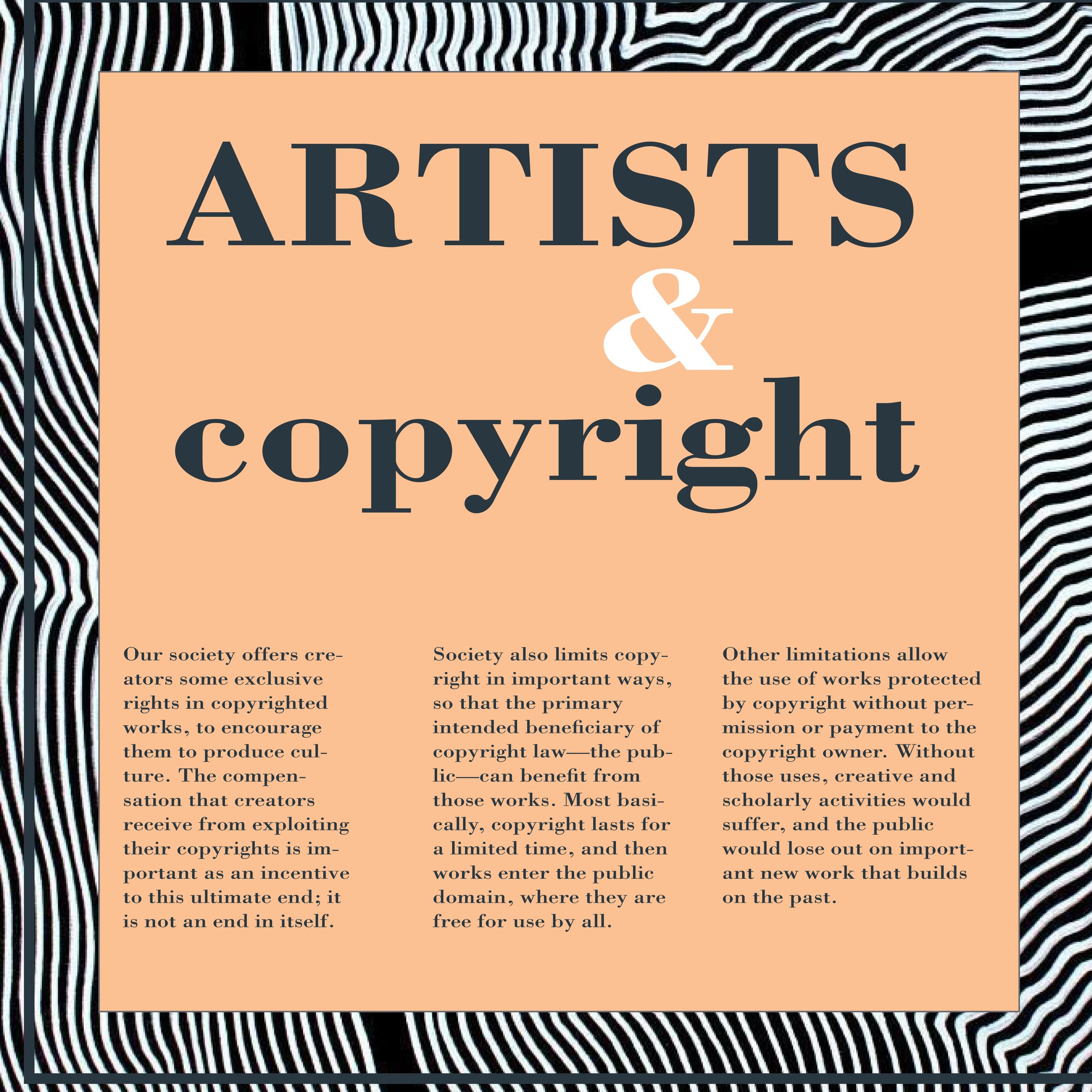
For the titles, I wanted to make them big and bold to make sure the viewer was to follow the focal point while creating a path that your eye follows.
The body text for all of my pieces use a grid structure to allow readability of the given information. Using a grid structure also helped create a more formal finish as if they were to be in a media such as a magazine.
With a project like this, I wanted to have one spot color to make the designs more simplistic.
I used imagery of art in 3 of the designs to create a connection to the meaning of the text. For example, in the top right print, I used a background image of balls to create C’s which represent the copyright symbol. We all know what that looks like so incorporating this aspect to the background draws your eye towards the middle while the red color creates contrast.